 |
Download Now
Server 1Download Now
Server 2Download Now
Server 3
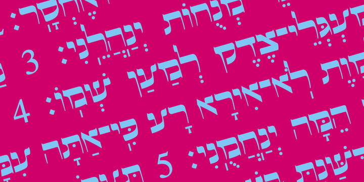
This is beautiful script font based in typeface of the Pirkei Avot book.
 |
| Hebrew Pirkei Avot Std |
 |
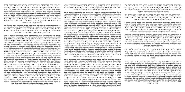
This is beautiful script font based in typeface of the Pirkei Avot book.
 |
| Hebrew Pirkei Avot Std |
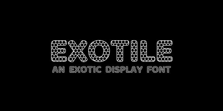 |
Hexagons are all over the place in nature : from honeycombs to snowflakes and the tiling patterns seen on fruits. That form guided me in the creation of this new font. So Exotile is a font inspired by nature.
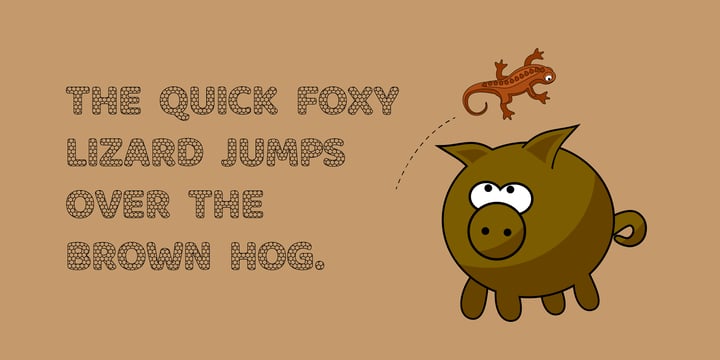
This typeface is ideal for display purposes. It comes in 3 different weights and support for different languages.
 |
| Exotile |
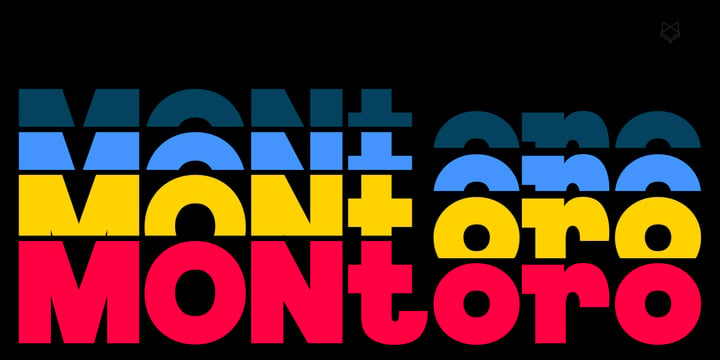 |
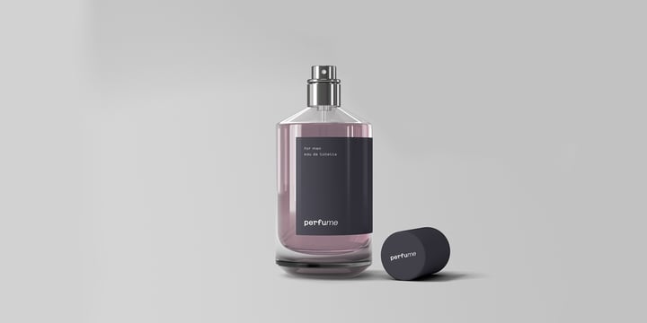
Montoro Display is a Brand New Luxury Typeface with a powerful font family. It has a dependable and uncompromising style, with controlled letterforms and modern touches. It looks amazing in logos, magazines, and movies . Montoro Font would be perfect for branding, headlines, Captions, paragraph, and posters . The various weights allow you to experiment with a wide range of applications. It's created to make an impression without sacrificing its beauty and readability. It's shown a clean, minimalist, warmth, quirky, yet still purposed to be versatile
The Typeface includes Six Weights - Regular, Medium, SemiBold, Bold, ExtraBold, and Black. All offer wide language support, upper and lower cases, numerals and extended punctuation.
Thank you for taking the time to look into the font.
 |
| Montoro Display |
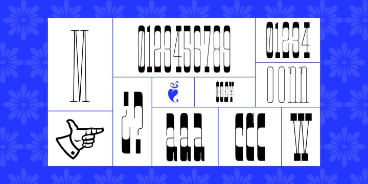 |
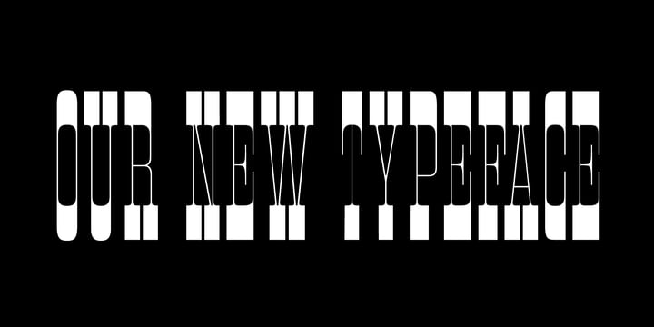
It is an Extra Condensed, Extra Light, Extra experimental and Extra display font.
Extra C is a fun font that doesn't take itself too seriously. Ideal for those who need a font with great character and personality but at the same time a delicate touch in their graphic pieces.
 |
| Extra C Variable |
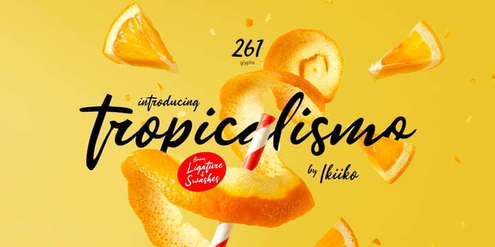
Introducing Tropicalismo Typeface, created by ikiiko.
A festive handwriting typeface with holiday vibes, fun and joy. You will feel the freshness and pleasure in expression. This typeface is perfect for an holiday season stuff like poster, flyer, or email blast. And also good for beauty product, packaging product, quotes, or simply as a stylish text overlay to any background image.
What's included?
Get also a good offer & FREEBIE at our site : www.ikiiko.com
Enjoy our font and if you have any questions, you can contact us by email : ikiikowrk@gmail.com
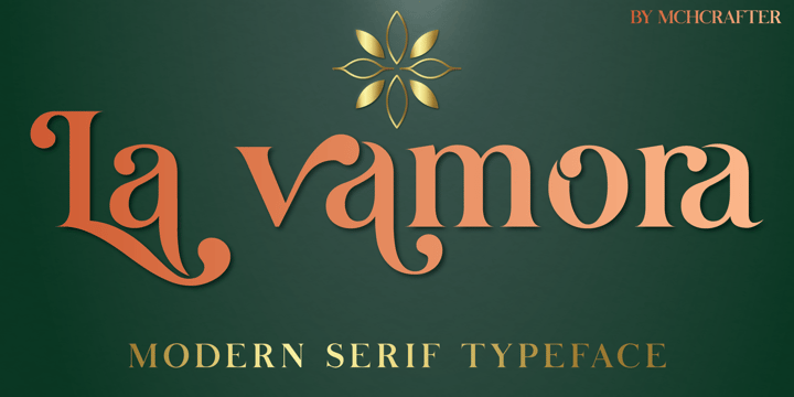
La Vamora is a Modern Stylistic Serif typeface
A new serif that we created specially for branding needs, with extra ligatures and alternates in a unique shape just to add value to your brand. It so nice to leverage designer or product owner that need solutions to make their design look more stylish and modern. And specially for La Vamora font, We prepared all the ligatures, and the alternates characters to help you create unlimited variations for your creative needs.
La Vamora includes:
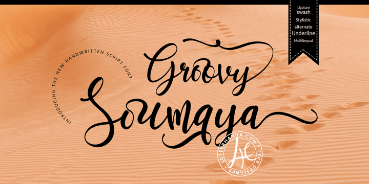 |
Groovy Soumaya Font is a beautiful and flowing handwritten font. Use it for wall displays, wedding invitations, social media post logos, advertisements, product packaging, product designs, labels, photography, watermarks, invitations, stationery, and any project that requires impressive typography.
To achieve that authentic handwritten feel, Groovy Soumaya Font comes with a full set of lowercase alternates as well as 34 ligatures.
You will get full set of lowercase and uppercase letters, numerals and punctuation, multilingual symbols, lowercase beginning and ending swashes, ligatures, stylistic alternates and extra swashes.
This font is also PUA encoded which means you can access all of the glyphs and swashes with ease!
FEATURES
- Uppercase and Lowercase letters
- Numbering and Punctuations
- Multilingual Support
- 34 Ligatures
- Beginning and ending swashes
- Underline swashes
- Stylistic alternate.
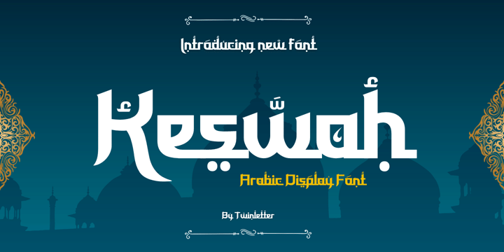 |
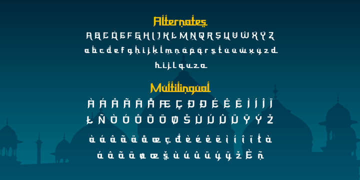
Keswah is a calligraphic display font inspired by the heritage of Middle Eastern typography. Each letter is carefully drawn by hand and then digitized to add subtle stroke variations. This font is suitable for a variety of your design needs, especially for designs that require a middle eastern theme
 |
| Keswah |
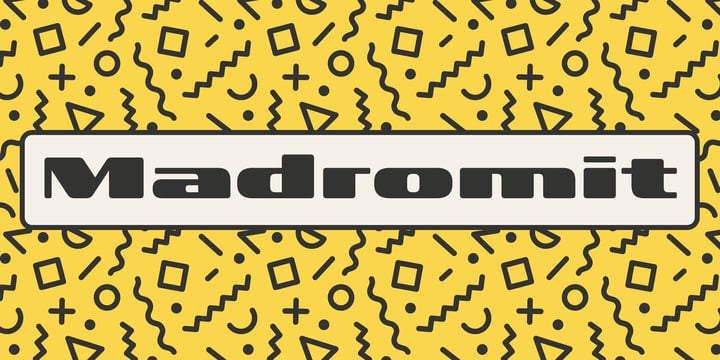
Madromit(ma-do-ro-mi) is a somewhat nostalgic display font.
Do you remember computer advertisements in the 80s and 90s? Yes, it is the most excited period in the history of computer.
We call the design in this period Primitive Digital Design.
Madromit is, so to speak, the revival or reconstruction of the primitive digital type in the period.
The structure and elements of this font are very simple and the key features are geometric shape and simple griddy design with rounded corners, oval bowls, and right‐angled joints which we used to see in the primitive period.
In addition to this, Madromit has one more characteristic feature — classic engraving font —. It is called Open Style.
Open style is one of the classic method to decorate and emphasize the font.
Our aim is the synergy by the mixture of primitive digital design and classic engraving method.
This mixture makes new impression we have never seen before.
Madromit family consists of 5 styles for stacking color font.
Please use Photoshop or Illustrator, or your favorite graphic design apps that can handle layers.
Layers are the printing plates of wood type. You should be able to change text color for each layers.
Madromit "Standard" style is the base of this font family.
You can add open effect by stacking "Fill" layers over the Standard layer.
Instruction
1. Type your text as you like.
2. Set font-name "Madromit" and font-style "Standard".
3. Set color of "Standard" layer.
4. Duplicate the "Standard" layer to make "Fill" layer.
5. Set font-style "Half Fill" or "Full Fill" and new color of upper layer.
Madromit Standard, Half Open, and Full Open style can be used solely.
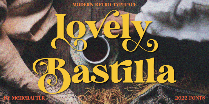 |
Lovely Bastilla font is a Modern Stylistic Serif typeface
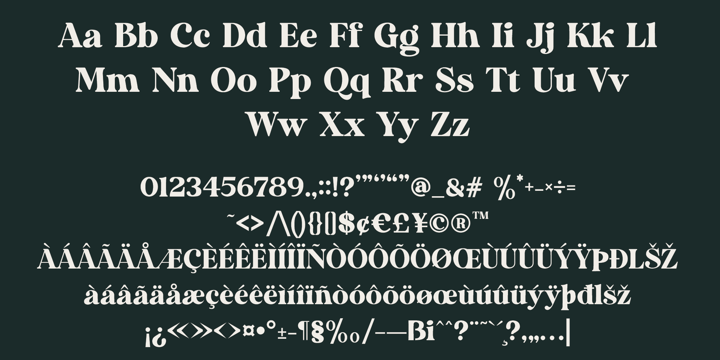
A new serif that we created specially for branding needs, with extra ligatures and alternates in a unique shape just to add value to your brand. It so nice to leverage designer or product owner that need solutions to make their design look more stylish and modern. And specially for Lovely Bastilla font, We prepared all the ligatures, and the alternates characters to help you create unlimited variations for your creative needs.
Lovely Bastilla font includes:
 |
| Lovely Bastilla |
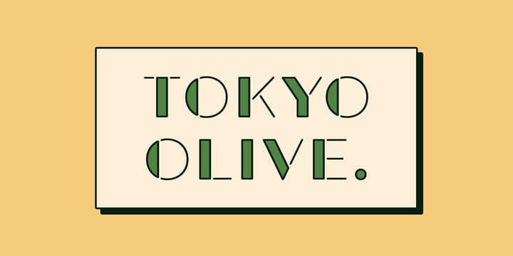 |
Tokyo Olive was designed as an homage to nostalgic display types and advertisements in the mid-late 80s.
The mid-late 80s was the era of the post-modernism and fancy-decorative design especially in Japan
In other words, it was the mixture of superficial form-operation and girly taste.
This curious design movement vanished without a trace in the 90s, but it had its moments.
Tokyo Olive has voluminous and simple geometric skeleton (for post-modern) with rounded and craft-style stencil joints (for fancy decoration).
We added a classic open style as a little spice. The mixture of those essences makes new impression we have never seen before.
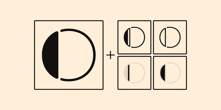
Tokyo Olive family consists of 5 styles for stacking color font.
Please use Photoshop or Illustrator, or your favorite graphic design apps that can handle layers.
Layers are the printing plates of wood type. You should be able to change text color for each layer.
Tokyo Olive "Standard" style is the base of this font family.
You can add open effect by stacking "Fill" layers over the Standard layer.
Instruction
1. Type your text as you like.
2. Set font-name "Tokyo Olive" and font-style "Standard".
3. Set color of "Standard" layer.
4. Duplicate the "Standard" layer to make "Fill" layer.
5. Set font-style "Half Fill" or "Full Fill" and new color of upper layer.
Tokyo Olive Standard, Half Open, and Full Open style can be used solely.
 |
| Tokyo Olive |
©
Iraida Belyakova
2014 . Powered by
Blogger
Blogger Templates
.
.